17 Gorgeous Living Room Paint Colors That Never Look Like a Mistake
Published: 25 Sep 2026
Paint is one of the lowest-cost, highest-impact updates you can make to a living room, but choosing the actual color is where most people get stuck, caught between playing it safe with plain white and risking a bold color that feels wrong within a year. Gorgeous living room paint colors work well because they balance genuine personality with real staying power, pulling from tones that flatter natural light, coordinate with common furniture finishes, and photograph beautifully rather than chasing a fleeting trend. The right color can also make a room feel larger, cozier, or more sophisticated, entirely independent of any furniture changes. This guide covers 17 gorgeous living room paint colors for every style and lighting condition, from soft neutrals to bold, saturated statement shades. Along the way, you will find honest pros and cons, real price ranges for paint and professional application, a color and finish comparison table, care advice, and answers to the questions people search most before choosing a living room paint color. By the end, you will know exactly which color fits your room’s light, your furniture, and your style.
Is Repainting Your Living Room Right for You?
Repainting a living room is one of the most cost-effective updates available, but it is worth weighing a few practical factors before committing to a specific color.
Pros
● Extremely high impact for the cost — paint changes a room’s entire mood and atmosphere for a fraction of what furniture or renovation would cost.
● Low commitment relative to other updates — unlike flooring or built-ins, a paint color can be changed again relatively easily and affordably if it does not work out as expected.
● Can correct or enhance a room’s natural light — the right color choice can make a dim room feel warmer, or a bright room feel more grounded and intentional.
● Works with virtually any existing furniture — a well-chosen paint color can tie together furniture pieces bought at different times far more effectively than buying all new furniture to match a single existing color.
Cons
● Color can look different than expected once fully applied — lighting, wall texture, and surrounding furniture all affect how a color reads in person compared to a paint chip or online preview.
● Bold colors require more commitment to repaint later — a deeply saturated wall color often needs more coats and more effort to fully cover if you later want to switch to something lighter.
● Professional application adds real cost — while paint itself is affordable, hiring a professional painter for a full room can represent a meaningful portion of a home improvement budget.
● Finish choice affects both look and durability — the wrong sheen for a specific wall’s use, like a flat finish in a high-traffic area, can lead to a wall that shows marks and is harder to clean.
For most homeowners, repainting the living room is one of the best value updates available, and testing a few sample swatches directly on your walls under your room’s actual lighting before committing to a full gallon is the single most important step in avoiding a color you regret.
1. Warm Greige
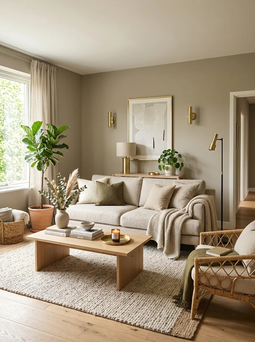
Warm greige, a blend of gray and beige with warm undertones, has remained one of the most reliably flattering neutral colors for living rooms, working well with both warm wood tones and cooler metal accents without leaning too far in either direction.
This color pairs beautifully with brass or matte black hardware, and it photographs consistently well across a range of lighting conditions, which is part of why it has stayed popular for so long.
Best suited for: living rooms wanting a safe, versatile neutral that still feels warmer and more considered than plain white or beige alone.
2. Deep Forest Green
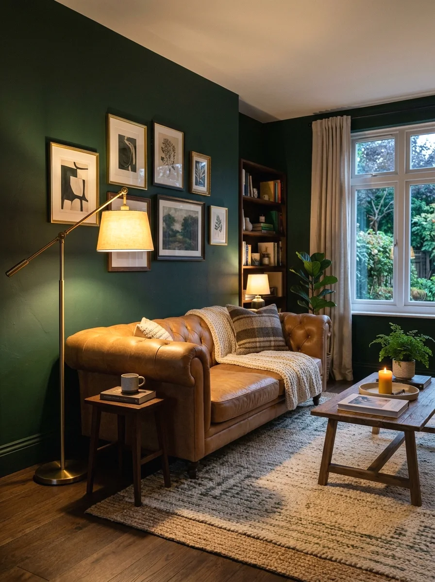
Deep forest green brings genuine sophistication and coziness to a living room, and its natural, earthy quality means it tends to feel timeless rather than trend-driven despite being a bolder color choice.
Pair forest green with warm wood tones and brass or gold accents for a rich, layered look, and consider it for a single accent wall if you want the drama without committing to a full room in the deep tone.
Best suited for: living rooms wanting a bold but timeless color statement, and rooms with good natural light to balance the deeper tone.
3. Soft Sage Green
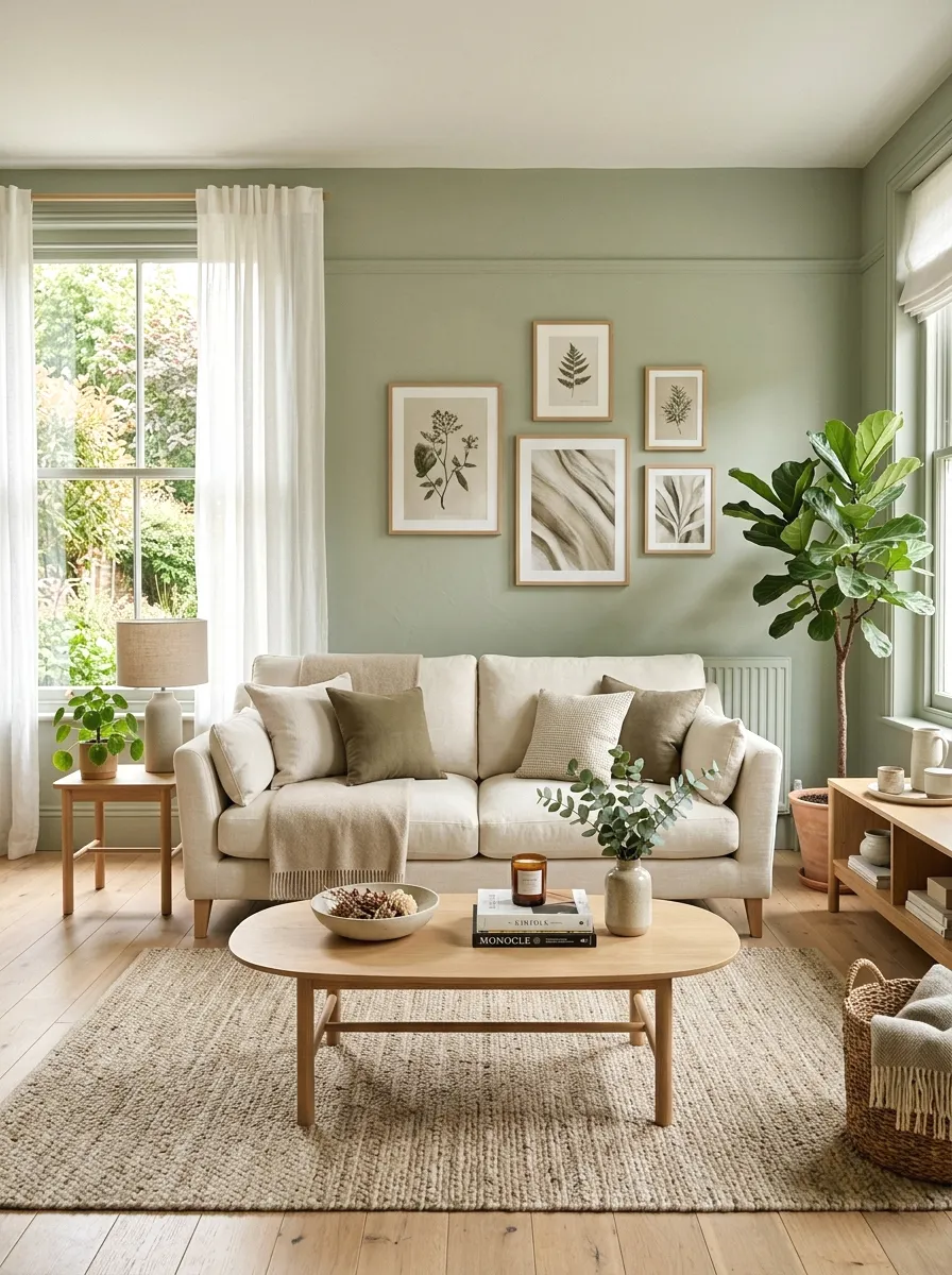
Soft sage green offers a gentler, more muted alternative to deep forest green, bringing an organic, calming quality to a living room without the visual weight of a more saturated color.
This color works especially well in rooms with strong natural light, where its subtle gray undertone keeps it from reading as overly sweet or pastel, instead feeling sophisticated and grounded.
Best suited for: living rooms wanting a calm, nature-inspired palette that still feels current and considered.
4. Classic Navy Blue
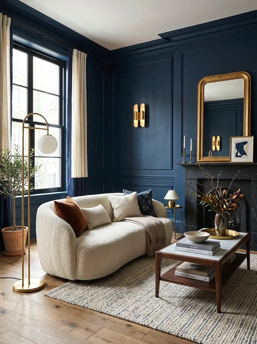
Navy blue is one of the most consistently popular bold color choices for living rooms, offering real drama and sophistication while still reading as a genuinely classic, rather than trendy, color decision.
Balance navy walls with lighter furniture and metallic accents to keep the room from feeling too dark or heavy, and consider a glossier finish to help bounce more light around the space.
Best suited for: living rooms wanting a bold, elegant statement with strong long-term staying power.
5. Warm Terracotta
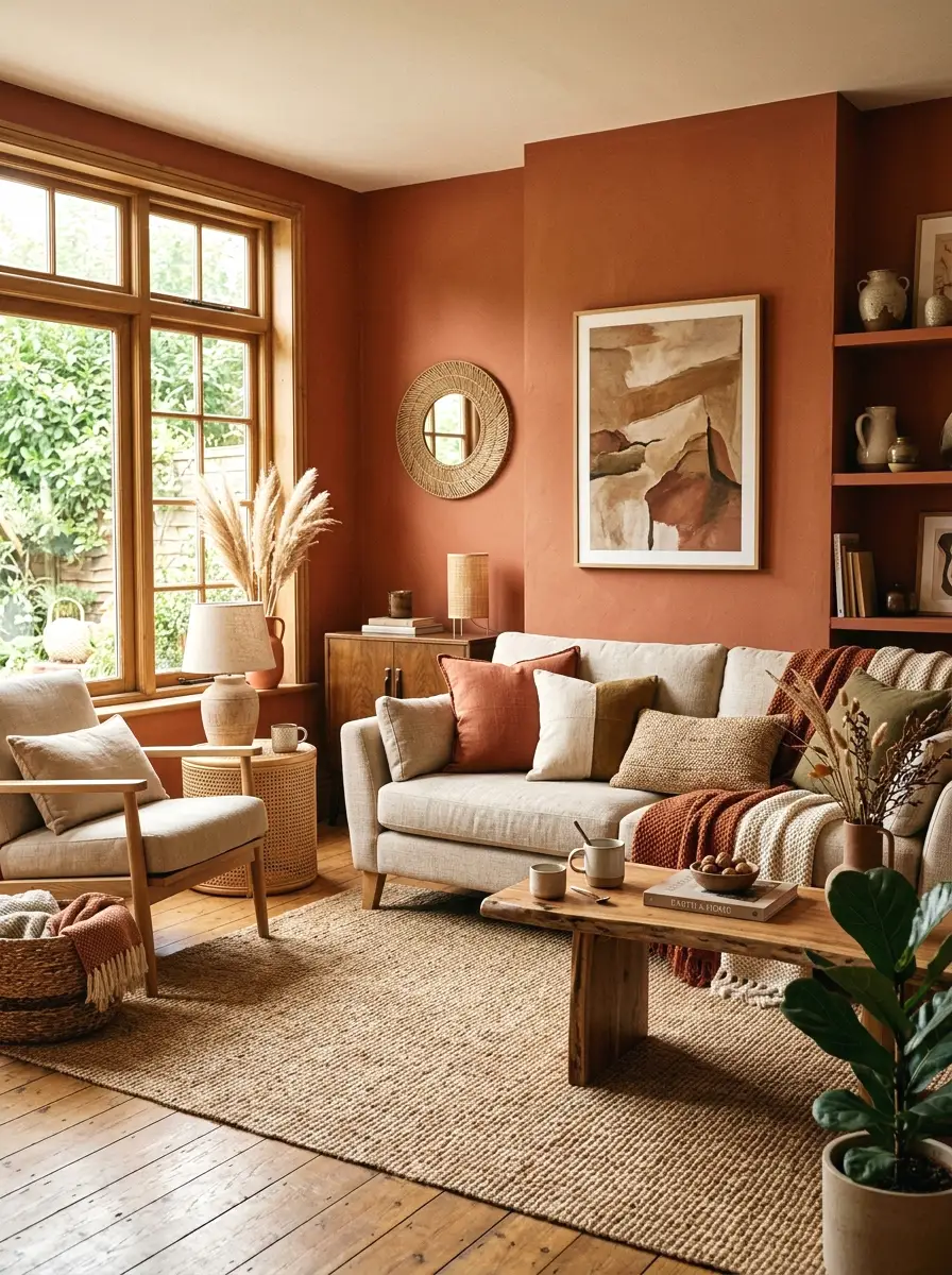
Warm terracotta brings genuine earthy richness to a living room, and its warm, sun-baked quality makes a room feel instantly cozier, particularly effective in spaces that otherwise run cool or lack strong natural light.
Pair terracotta with natural materials like jute, rattan, and warm wood for a cohesive organic-modern look, and use it as an accent wall if a full room feels like too bold a commitment.
Best suited for: living rooms wanting genuine warmth and an organic, earthy color palette.
6. Deep Charcoal Gray
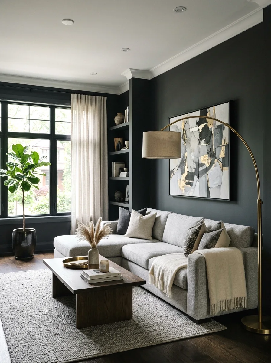
Deep charcoal gray gives a living room a genuinely modern, dramatic edge, and unlike black, it retains enough warmth and depth to avoid feeling stark or overly severe in most lighting conditions.
This color works particularly well in rooms with strong architectural details or good natural light, since the depth of the color benefits from having something to contrast against.
Best suited for: modern and contemporary living rooms wanting a bold, moody statement.
7. Creamy Off-White
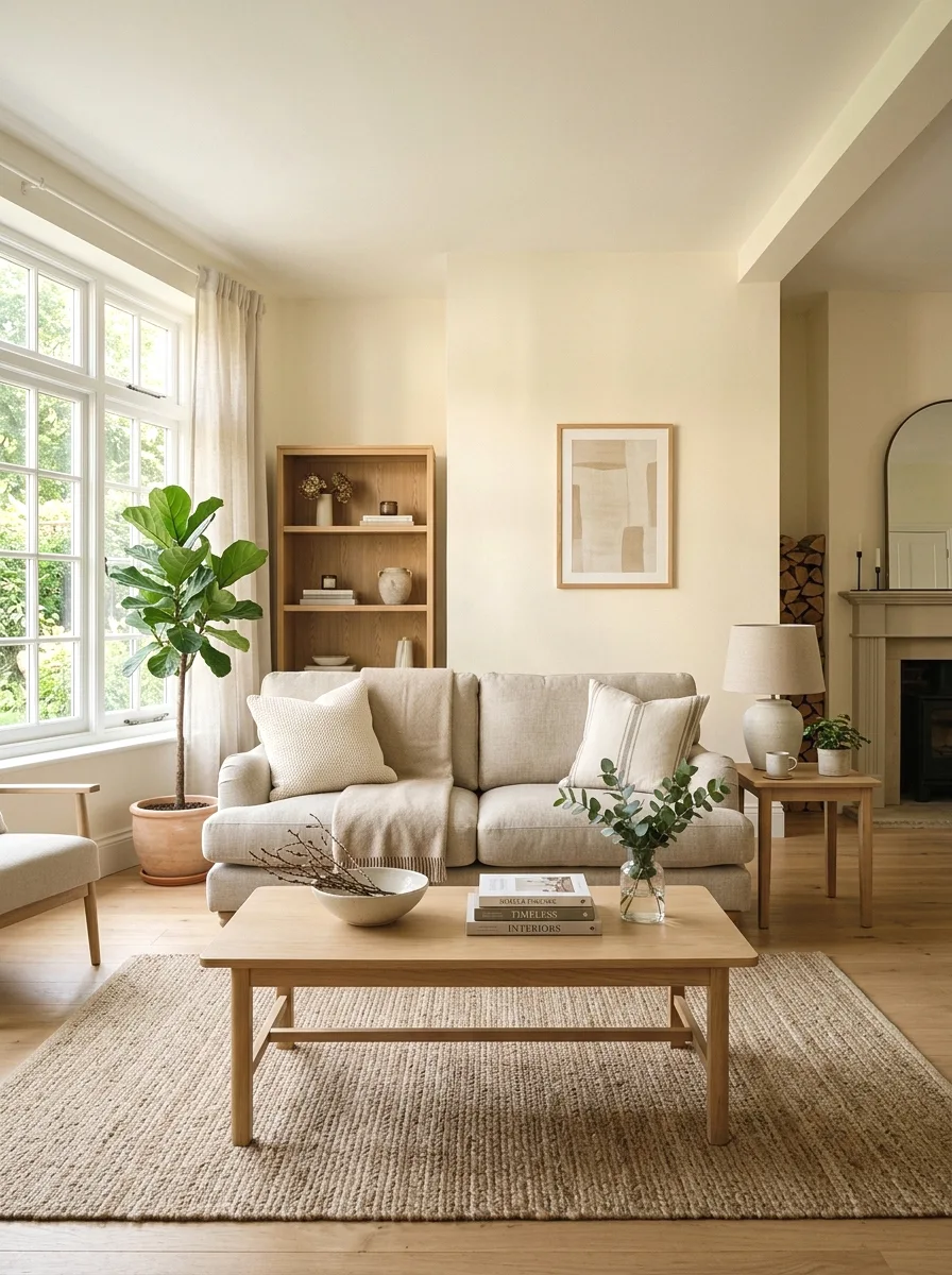
A warm, creamy off-white avoids the stark, clinical feel that a pure white can sometimes create, offering a softer backdrop that still keeps the room feeling bright and open while adding a touch more warmth.
Test several off-white swatches directly on your wall, since undertones vary significantly between yellow-leaning, pink-leaning, and gray-leaning creams, and the wrong undertone can clash with existing trim or flooring.
Best suited for: living rooms wanting a timeless, versatile backdrop that works with virtually any furniture style or color scheme.
8. Dusty Blue
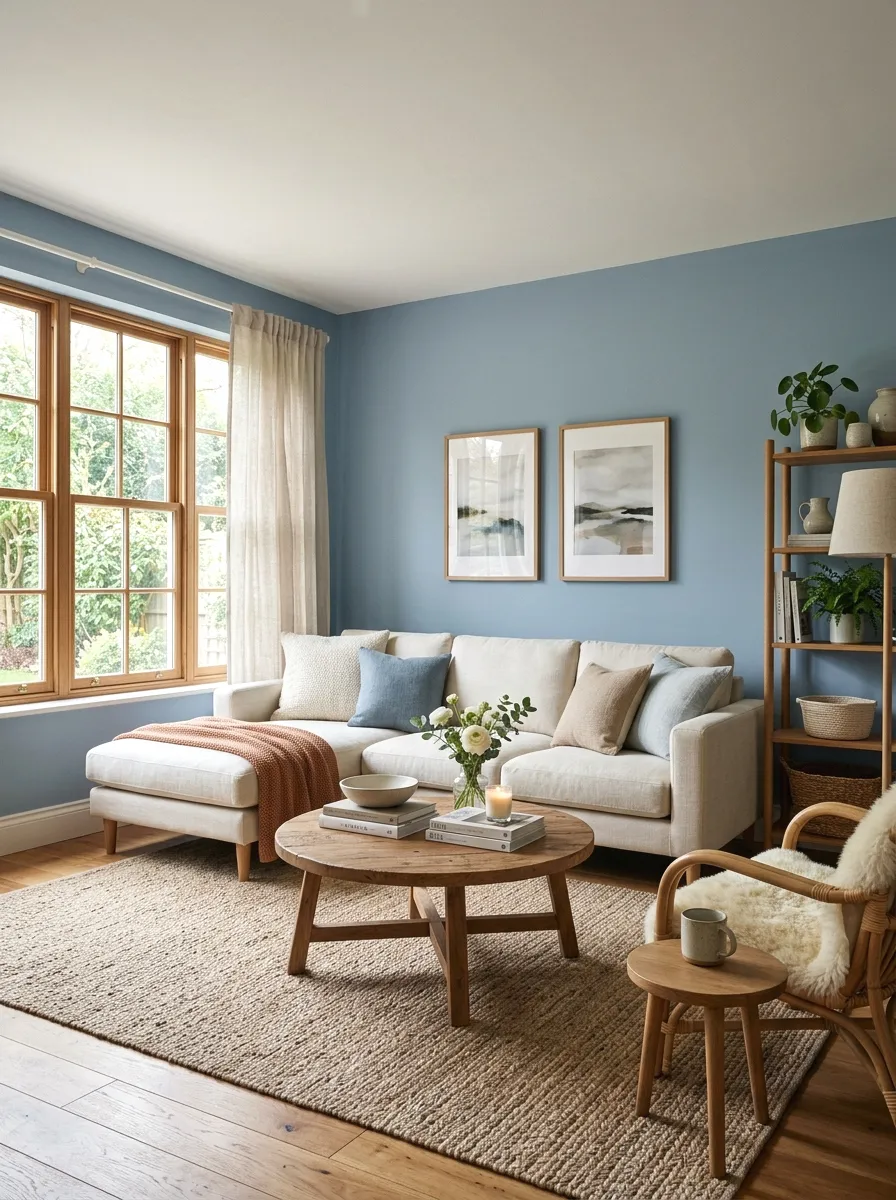
Dusty blue offers a softer, more muted alternative to navy, bringing a calm, airy quality to a living room that works well in both traditional and modern settings without feeling overly saturated.
This color pairs beautifully with warm wood tones and brass accents, which help balance its inherently cool undertone and keep the overall room from feeling too cold.
Best suited for: living rooms wanting a calm, versatile blue that is bolder than white but softer than a deep navy.
9. Rich Oxblood or Burgundy
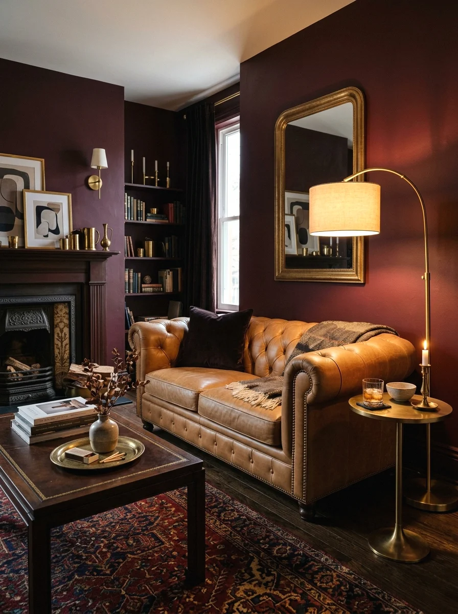
A deep oxblood or burgundy brings genuine richness and drama to a living room, working especially well in rooms wanting a moody, library-inspired atmosphere rather than a bright, airy feel.
Pair this color with warm wood tones, leather furniture, and brass or gold accents for a cohesive, richly layered look, and consider it for a smaller room or a single accent wall given its strong visual weight.
Best suited for: living rooms wanting a bold, luxurious statement with a distinctly moody, sophisticated atmosphere.
10. Warm Taupe
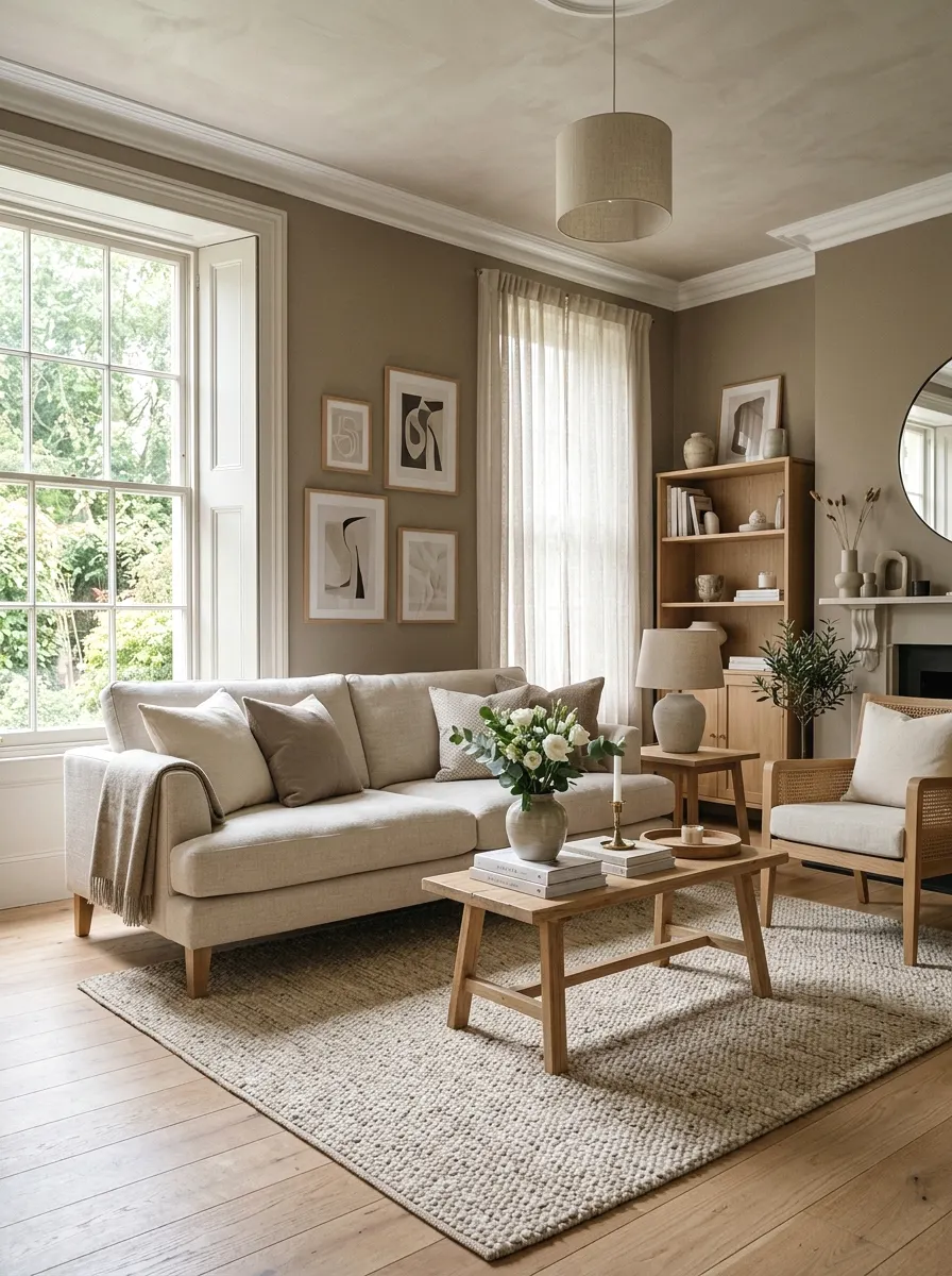
Image Prompt
A living room painted in a warm taupe tone, featuring a neutral sofa and light wood furniture. Soft natural light fills the room. The mood is understated and elegant. Photorealistic, no people in frame, editorial interior photography style.
Warm taupe sits between beige and brown, offering a sophisticated, understated neutral that reads as more intentional and elevated than a standard builder-grade beige.
This color works well across a wide range of lighting conditions and pairs easily with both warm and cool accent colors, making it one of the more flexible choices if you plan to change furniture or accessories over time.
Best suited for: living rooms wanting a refined, versatile neutral with more depth than a standard beige.
11. Soft Blush Pink
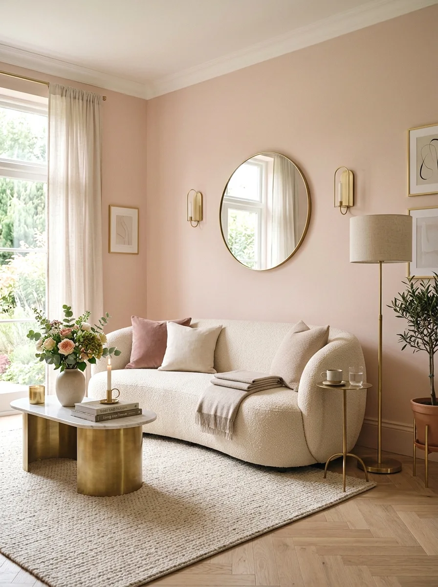
A soft, muted blush pink brings gentle warmth and personality to a living room without the intensity of a bolder color, and a dusty, gray-toned version in particular reads as sophisticated rather than overly sweet.
Pair blush walls with warm metallic accents like brass or rose gold, and balance the softness with a few grounding neutral or darker elements so the room does not feel one-note.
Best suited for: living rooms wanting a soft, romantic color statement that still feels current and considered.
12. Muted Olive Green
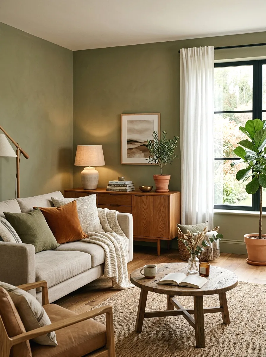
Muted olive green offers a more subdued, earthy alternative to brighter greens, bringing a grounded, nature-inspired quality to a living room that pairs especially well with warm wood and natural textures.
This color tends to shift noticeably under different lighting, appearing more gray in low light and more distinctly green in bright natural light, so it is worth testing samples at different times of day.
Best suited for: living rooms wanting an earthy, grounded color that still feels distinct from more common sage or forest green choices.
13. Deep Chocolate Brown
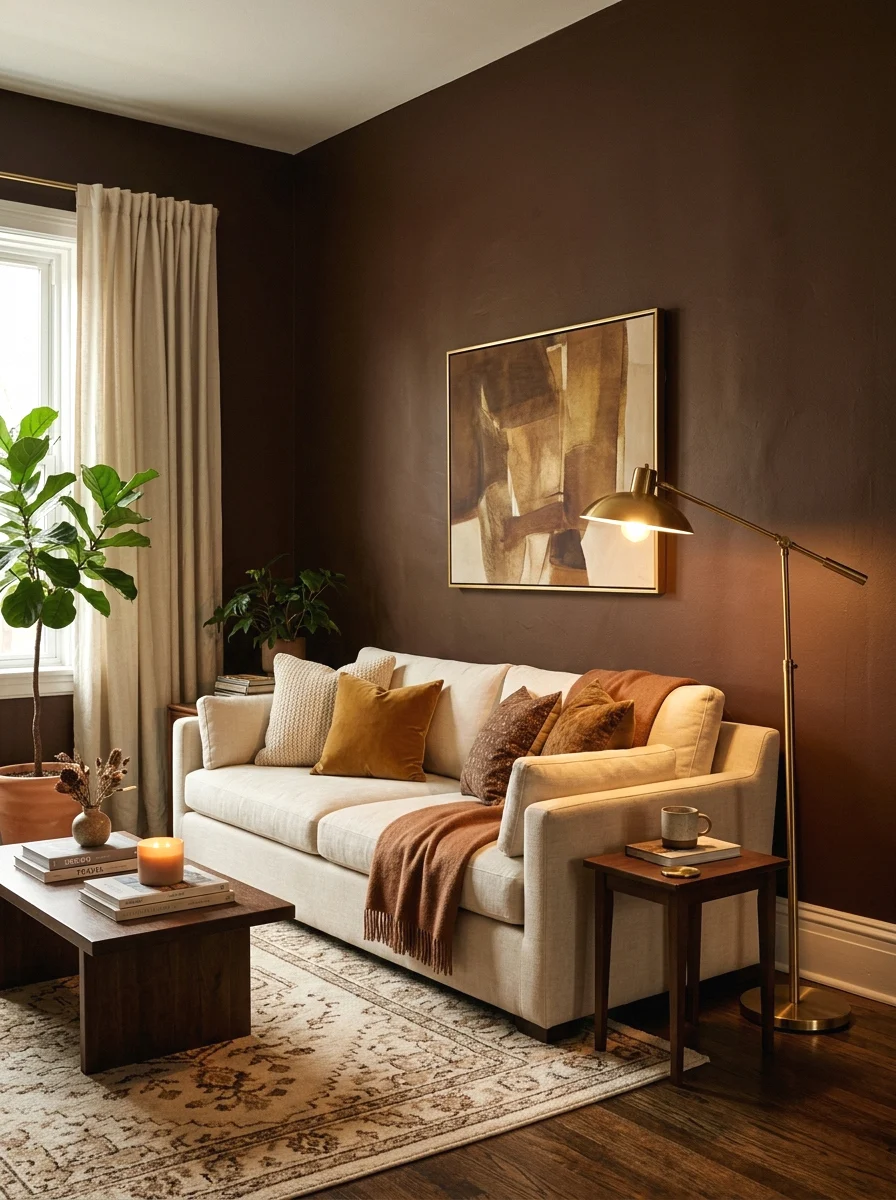
Deep chocolate brown has made a genuine comeback in recent years, bringing a warm, enveloping quality to a living room that reads as cozy and sophisticated rather than dated, particularly when paired with lighter furniture.
Balance the depth of chocolate brown walls with cream or white furniture and plenty of texture, since an all-dark room without contrast can start to feel heavy rather than intentionally cozy.
Best suited for: living rooms wanting a warm, enveloping color statement and rooms with adequate natural or supplemental lighting.
14. Muted Mustard or Ochre
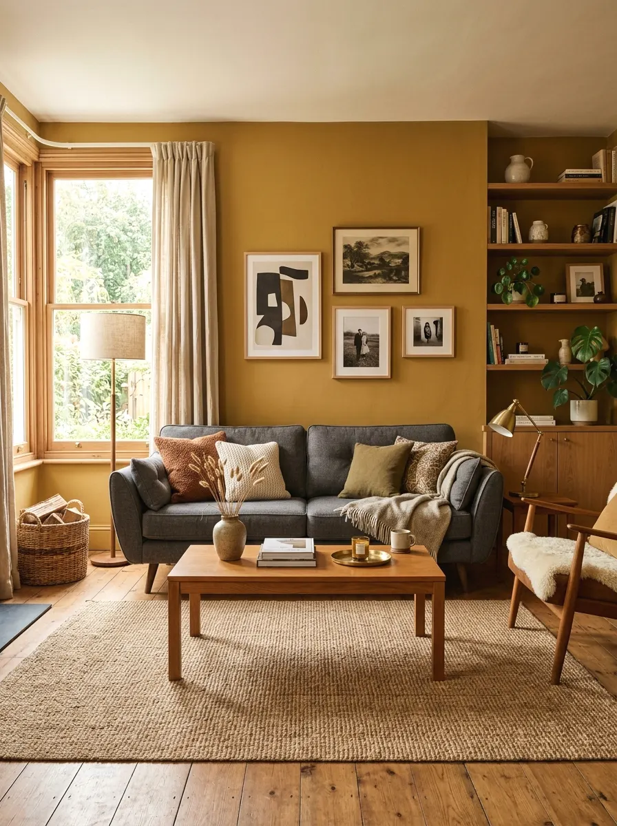
A muted, earthy mustard or ochre brings genuine warmth and confidence to a living room, and choosing a more muted, less saturated version keeps the color from feeling overly bold or difficult to live with long-term.
Pair mustard walls with charcoal, navy, or deep green furniture for a rich, grounded contrast, and consider this color for a smaller accent wall if a full room feels like too much commitment.
Best suited for: living rooms wanting a warm, distinctive color statement that stands apart from more common neutral choices.
15. Classic Black Accent Wall
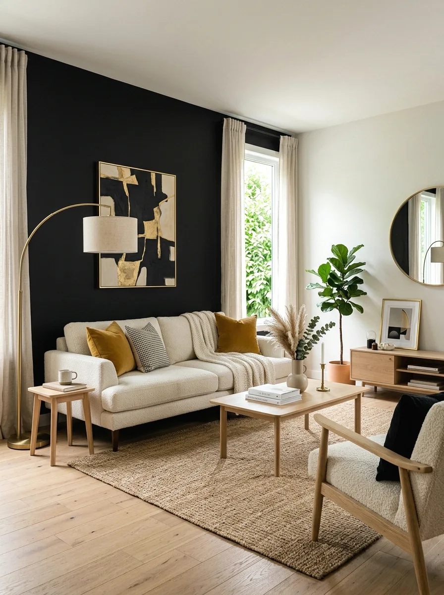
A black accent wall, rather than a full room, gives a living room genuine drama and a strong focal point, and the color works surprisingly well in rooms with good natural light, where the contrast actually enhances rather than darkens the overall space.
Reserve black for a single wall rather than the full room in most cases, and balance it with plenty of lighter furniture, metallic accents, and adequate lighting to keep the room feeling intentional rather than cave-like.
Best suited for: modern living rooms wanting a bold single-wall statement, and rooms with strong natural or supplemental lighting.
16. Soft Dove Gray
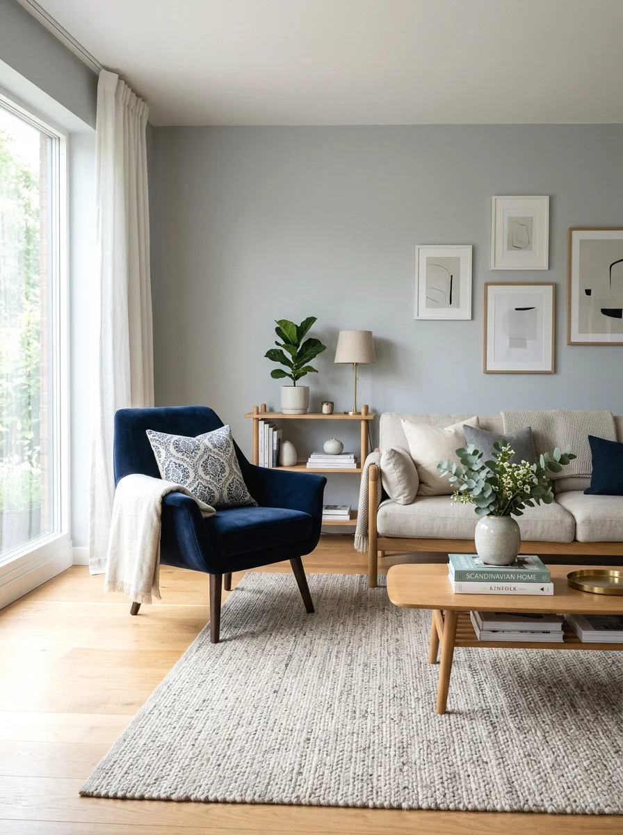
Soft dove gray offers a cool, refined neutral that works especially well in modern and transitional living rooms, providing a clean backdrop that lets furniture and accent colors stand out clearly against it.
Choose a dove gray with a slightly warm undertone if your room lacks strong natural light, since a very cool gray can read as flat or slightly cold in dimmer conditions.
Best suited for: modern and transitional living rooms wanting a clean, refined neutral backdrop.
17. Warm Butter Yellow
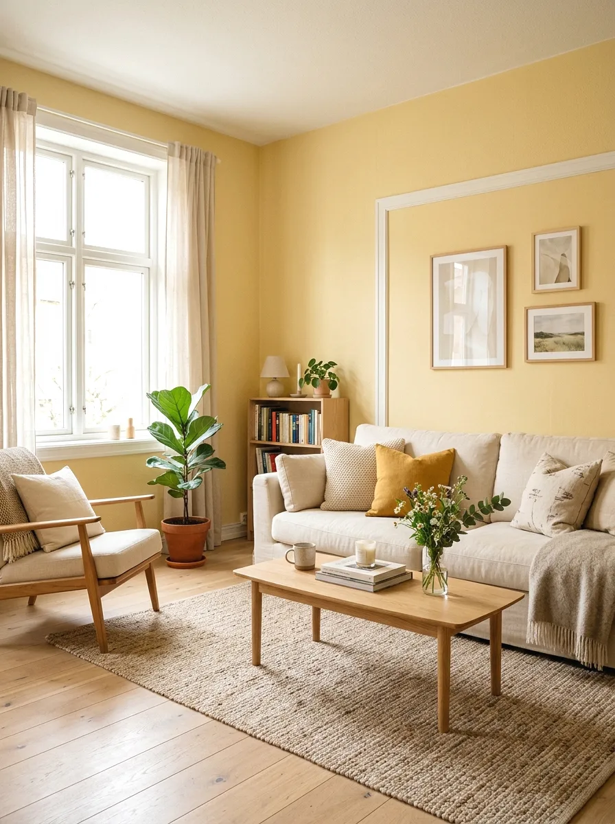
A soft, warm butter yellow brings genuine cheerfulness and light to a living room, and a more muted, less saturated version reads as sophisticated and inviting rather than overly bright or childlike.
This color works especially well in rooms with limited natural light, where the warm tone can help compensate for a lack of sunlight, though it is worth testing the specific shade under your room’s actual lighting before committing.
Best suited for: living rooms wanting a cheerful, warm color statement, and rooms lacking strong natural light.
Planning and Buying Tips
A few practical decisions up front will help you choose a color that looks as good on the wall as it did on the swatch or in inspiration photos.
● Test large sample swatches directly on your walls — paint a section at least 2 by 2 feet in multiple spots around the room, and observe it at different times of day before committing to a full gallon.
● Standard sizing to shop for — one gallon of paint typically covers 350 to 400 square feet with one coat, and most rooms need two coats for full, even color coverage, especially with a color change or a bold new shade.
● Choose the right sheen for the room’s use — eggshell or satin finishes generally offer the best balance of a soft look and washability for living room walls, while high-traffic areas may benefit from a slightly higher sheen.
● Account for your room’s natural light direction — north-facing rooms tend to have cooler, bluer light that can make colors read cooler than expected, while south-facing rooms have warmer light that can intensify warm tones.
● Consider existing flooring and trim colors — a paint color that clashes with existing wood tones or trim can undermine an otherwise well-chosen color, so bring flooring and trim samples when testing paint swatches.
● Budget for professional painting if the room has high ceilings or detailed trim — a professional painter typically ensures cleaner lines and more even coverage than DIY application in more complex rooms.
Cost Breakdown: Budget, Mid-Range, and Luxury Paint Projects
Repainting a living room is one of the more affordable home updates available, with cost driven mainly by paint quality and whether the work is DIY or professionally done.
Budget ($50–$200)
Standard-quality paint and basic supplies for a DIY project fall in this range, typically covering a single average-sized living room with two coats.
Mid-Range ($200–$800)
Premium paint with better coverage and durability, plus professional painting labor for a single room, sits in this tier, particularly for rooms with standard ceiling heights and minimal trim detail.
Luxury / Premium ($800–$2,500+)
High-end designer paint brands, custom color matching, and professional painting for rooms with high ceilings, detailed trim, or multiple accent walls fall here, with labor typically representing the largest cost component.
Color Palette and Mood Comparison
| Color Family | Mood | Best Light Condition | Pairs Well With | Best For |
| Warm neutrals (greige, taupe, cream) | Calm, versatile | Any lighting condition | Wood tones, brass, mixed styles | Safe, timeless updates |
| Deep greens (forest, olive) | Sophisticated, grounded | Bright natural light | Brass, warm wood, leather | Bold but timeless statements |
| Blues (navy, dusty blue) | Elegant, calm | Bright to moderate light | Cream, gold, warm wood | Classic, dramatic or airy looks |
| Warm earth tones (terracotta, mustard, chocolate) | Warm, inviting | Rooms with limited natural light | Natural textures, charcoal, navy | Cozy, grounded atmospheres |
| Bold darks (charcoal, black, oxblood) | Dramatic, moody | Bright natural light preferred | Metallics, light furniture | Statement walls and modern drama |
| Soft pastels (blush, butter yellow) | Soft, cheerful | Any lighting condition | Brass, cream, light wood | Gentle personality without heavy commitment |
Care Tips
● Painted walls — dust regularly with a soft, dry cloth or vacuum brush attachment to prevent buildup, particularly in high-traffic living rooms.
● Eggshell and satin finishes — clean marks with a soft, slightly damp cloth and mild soap, avoiding abrasive scrubbing that can burnish or shine the paint’s finish unevenly.
● Flat finishes — spot clean carefully, since flat paint is more prone to showing burnish marks from scrubbing than higher-sheen finishes, and touch up with matching paint rather than aggressive cleaning for stubborn marks.
● Dark and bold colors — check periodically for fading in areas with direct, prolonged sunlight exposure, since deeply saturated colors can show uneven fading over time more visibly than lighter neutrals.
● Trim and edges — inspect painter’s tape lines and trim edges periodically, touching up any chipping promptly to keep the overall paint job looking crisp and well-maintained.
● Common mistake to avoid — skipping the sample swatch testing step and committing to a full gallon based solely on a small paint chip, which is the most frequent cause of paint color regret.
Frequently Asked Questions
What is the most popular paint color for living rooms right now?
Warm neutrals like greige and warm taupe remain consistently popular for their versatility, while deep, sophisticated colors like forest green and navy blue have also seen sustained popularity as bolder but still timeless choices.
How do I choose a paint color for a room with limited natural light?
Warm tones like terracotta, warm butter yellow, and warm greige tend to perform better in rooms with limited natural light, since cooler colors like gray or blue can read as flat or cold without adequate sunlight to bring out their intended tone.
Should I paint my living room a bold color or stick with neutrals?
This depends on your comfort with commitment and how the color will interact with your existing furniture, but a bold accent wall is often a good middle ground for those wanting personality without committing an entire room to a saturated color.
What paint finish is best for living room walls?
Eggshell or satin finishes generally offer the best balance for living room walls, providing a soft, low-glare look while still being more washable and durable than a flat finish, particularly in high-traffic areas.
How many paint samples should I test before choosing a color?
Testing at least two to three finalist colors directly on your walls, in swatches of at least 2 by 2 feet, and viewing them at different times of day is generally recommended before committing to a full room’s worth of paint.
How to Choose the Right Living Room Paint Color for You
The right color depends on three factors: your room’s natural light direction, your existing furniture and flooring tones, and how bold a statement you are comfortable committing to. Rooms with strong natural light can handle a wider range of colors, including cooler tones and deeper shades, while dimmer rooms generally benefit from warmer colors that compensate for the lack of sunlight.
Budget should guide paint quality more than color choice itself, since premium paint offers better coverage and durability regardless of which color you select, making it worth the investment even for a more modest project.
Finally, be honest about your appetite for boldness. A safe neutral like warm greige or soft dove gray will not disappoint, but a well-chosen bold color like deep forest green or navy can transform a room’s entire atmosphere if you are ready to commit to a genuine style statement.
Test your top two or three finalist colors directly on your walls before buying a full gallon, living with the samples for a few days across different lighting conditions — the perfect living room paint color is the one that still looks right in both morning light and evening lamp light, not just under the store’s fluorescent lighting.



- Be Respectful
- Stay Relevant
- Stay Positive
- True Feedback
- Encourage Discussion
- Avoid Spamming
- No Fake News
- Don't Copy-Paste
- No Personal Attacks
- Be Respectful
- Stay Relevant
- Stay Positive
- True Feedback
- Encourage Discussion
- Avoid Spamming
- No Fake News
- Don't Copy-Paste
- No Personal Attacks
